How to successfully use colours in flooring
There’s a saying that you can learn more about someone by looking at their room for ten seconds than by spending 10 years in their company. While this might be a slight exaggeration, the colour and decor of a room tend to reveal the kind of character who owns it. From the shade of the curtains to the flooring underneath, nothing speaks louder than one thing. Colour.
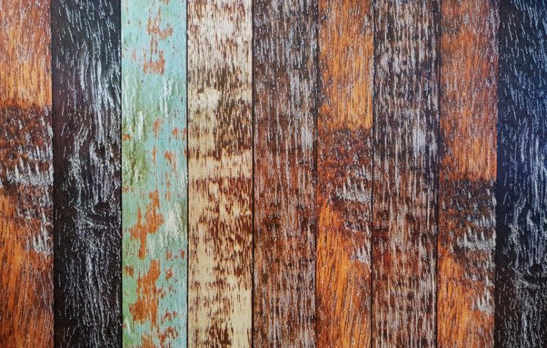
The use of colours in flooring is the best way to radically define the theme of a home, with almost endless possibilities. With great power comes great responsibility, and changing the colour of a floor once it has been fitted is often not possible (unless you’re staining hardwoods). With this in mind, here’s some helpful advice to aid you in making the right choice.
Work with what you’ve got
If you’re renovating a single room, have a look at the surroundings before fitting a new floor. The wallpaper, the ceiling and the colour of the furniture should all complement the original palette used, or at least fit a consistent theme. For example, a lighter wood or carpet helps bring the most out of a pastel arrangement, while a heavily stained hardwood might be more suitable for a modern, contemporary feel, helping to bring stylised white furniture to the fore.
It’s important to remember that rooms don’t stand in isolation; therefore, creating a sense of flow is vital. This means that any wooden flooring should match that used in adjacent rooms, unless you’re aiming to mix and match different flooring types, in which case it’s important to carefully plan the colour scheme with the whole home in mind.
Playing the shade game
Colours are made up of three aspects: brightness, hue and brilliance. The first of these refers to how light a particular shade is and is the most important factor to consider when looking at the size of a room. While darker shades bring out the warmth in their surroundings, they can also make rooms with low ceilings feel more cramped. Meanwhile, the opposite is true for lighter shades; they can make small rooms feel more spacious, yet larger rooms feel a little impersonal. The key here is to, once again, think about the overall theme of your home – do you want it to feel warm and cosy, or grand and expansive?
Setting the mood
The second aspect – hue – refers to the part of colour that can be described, such as “red” or “turquoise”. When it comes to flooring, most people choose to stick to natural tones – encompassing a wide variety of browns or whites. These allow the decor to stand out without visually dominating a room. Carpets allow a little more leeway, as they come in a greater variety of colours and textures. Again, neutral tones are the most popular, although blues, yellows and greens can be used to good effect as long as they remain fairly muted.
To add a dash of colour to a room, consider using a patterned rug as a centrepiece. This helps to visually knit a room together without making it look fragmented. On a similar theme, use the ‘rule of thirds’. Simply put, this means you shouldn’t be able to see more than three flooring types from any room in the house, including rugs.
Not only does colour choice influence the look of a home, but it also influences the mood of those within it. Indeed, warm browns have been shown to trigger a positive feeling (strangely, this effect is greater in men), while studies have demonstrated that greys suppress appetites! They can look striking, however, especially with black or blue highlights – just maybe stay clear of the dining room.
Brilliance is overrated
The final aspect of colour is its brilliance, that is, how striking a colour appears. A particularly brilliant blue might be one of an amazing sky or the coastal waters off a Caribbean island. Swim out a little further, though, and the seas become more muted, still blue, yet somehow less so. When it comes to picking the right flooring colour, it’s best to go for these less brilliant tones, keeping everything calm and put-together. Remember, flooring is the foundation for everything else, so it should act as a platform for objects to shine without dominating the scene. Of course, if you want to get a super-airy beach house theme, the brilliance of pale flooring can be notched up a little, reminiscent of the sands nearby.
Just be you
At the end of the day, there’s no such thing as the ‘right’ way to utilise colours in flooring. If you have a tiny cottage, who’s to say you can’t go beyond its traditional rustic style? Nobody, that’s who. At Hudson flooring, we know that a home is a reflection of the person inside of it, that’s why we work with all our customers to help them achieve the look that matches them. It may only take ten seconds to get to know someone, but don’t worry, we’ll allow as much time as you need. Get in touch today!